That pesky temperature stasis (referred to by Warmists as a "slowdown" now that they have eventually admitted it)
Since even Warmist figures show temperatures on a plateau for the last 17 years that is mighty embarrassing to Warmists. Something must be done! And, regrettably, the only thing that CAN really be done is to throw all the existing figures out the window! And a new paper by Cowtan and Wray (no relation) does just that. And their new method of juggling the figures shows warming!
Skeptics have of course been having a ball poking holes in it but I will simply reproduce below Judith Curry's evaluation of the paper. As a senior climate scientist, she knows where the skeletons are buried. After a thorough survey of the paper she concludes as follows:
Let’s take a look at the 3 methods they use to fill in missing data, primarily in Africa, Arctic, and Antarctic.
1. Kriging
2. UAH satellite analyses of surface air temperature
3. NCAR NCEP reanalysis
They state that most of the difference in their reconstructed global average comes from the Arctic, so I focus on the Arctic (which is where I have special expertise in any event).
First, Kriging. Kriging across land/ocean/sea ice boundaries makes no physical sense. While the paper cites Rigor et al. (2000) that shows ‘some’ correlation in winter between land and sea ice temps at up to 1000 km, I would expect no correlation in other seasons.
Second, UAH satellite analyses. Not useful at high latitudes in the presence of temperature inversions and not useful over sea ice (which has a very complex spatially varying microwave emission signature). Hopefully John Christy will chime in on this.
Third, re reanalyses in the Arctic. See Fig 1 from this paper, which gives you a sense of the magnitude of grid point errors for one point over an annual cycle. Some potential utility here, but reanalyses are not useful for trends owing to temporal inhomogeneities in the datasets that are assimilated.
So I don’t think Cowtan and Wray’s analysis adds anything to our understanding of the global surface temperature field and the ‘pause.’
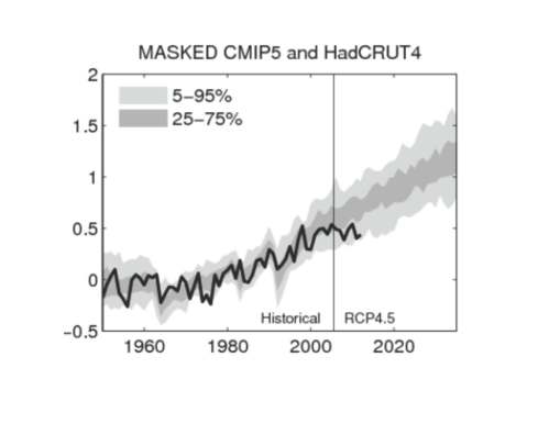
The bottom line remains Ed Hawkins’ figure that compares climate model simulations for regions where the surface observations exist. This is the appropriate way to compare climate models to surface observations, and the outstanding issue is that the climate models and observations disagree.
SOURCE
That's a pretty swingeing dismissal of the paper. Note: Kriging is estimating a curve from a small number of data points: Educated guesswork, in short -- JR
Posted by John J. Ray (M.A.; Ph.D.).
No comments:
Post a Comment